Earth Size

Earth Size
Relative Size of the Sun and Earth

Friday, September 26, 2014

Copernican Model Simulation

Here's a quick simulation of why the heliocentric Copernican model predicts retrograde motion, as opposed to it being something accounted for in the Greek geocentric models by epicycles.  Just move the mouse over the area to control the Earth --- Mars moves automatically at the right (slower) rate, so it's easy to see what happens when we overtake it during our orbit around the Sun.  The apparent position of Mars relative to some background stars is at top.  Mars appears to move backwards at opposition because of our relative positions and the parallax of our sight-lines.

I've found over the last couple of semesters that students seem to "get it" much more quickly when they play with this for just a few seconds as opposed to looking at a static image as they'd usually see in a book.

This will ultimately be included in a longer article about orbits in general.


Copernican Simulator --- Retrograde Motion

HTML 5 Canvas Animation


Wednesday, July 2, 2014

Test page for Embedded Javascript Interaction

I'm glad it's fairly easy to insert Javascript code into the Blogger environment so I can write some simulations to go along with my (slowly) expanding set of Astronomy 101 notes.  If anything is certain, it's that this demo page is not very exciting.  But I'm looking forward to writing much cooler interactive simulations soon.


An HTML5 Canvas Element

HTML 5 Canvas Animation

 It's easy to create a simulation that runs while the reader watches.


Sunday, June 22, 2014

Using Reason as a Lever

I've developed a deliberate habit of teaching without notes.  To be sure, I've got a good idea of what I'd like to cover that day and a mental list of examples, derivations, and group-work problems to fall back on, but I love it when we get sidetracked for a while discussing something I hadn't anticipated.

For example, one of the most wonderful things about science is the way seemingly simple and irrelevant experiments can actually reveal an understanding about something much deeper.  In my freshman physics class, we were winding up a section on harmonic (spring/elastic) motion and I was suggesting that there were many different kinds of physical situations that could be (however approximately) described by the same equations.  This is the real reason for spending so much time on springs --- not that they'll spend any significant time in their careers using actual springs, but that knowing how to analyze a simple system means that they may be able to use it as an approximation for very much more complicated systems.

It turns out that the motion of a simple pendulum can be approximated by the same equations for elastic systems.  Suppose you have a string and a weight tied to one end:

A mass \(M\) on a string of length \(\ell\).  The mass feels a tension \(T\) pulling at an angle \(\theta\)
with respect to the vertical.  At this moment it's a distance \(x\) from the vertical.

Here, I suppose that the vertical motion is small compared to the horizontal motion (which is about right for small oscillations).  So then in the vertical direction, Newton's 2nd Law gives
\[T\cos{\theta} = Mg\]
and in the horizontal direction
\[T\sin{\theta} = Ma\]
Now, if the oscillations really are small, then \(\cos{\theta} \approx 1\).  And from the diagram, \(\displaystyle \sin{\theta}=\frac{x}{\ell}\), so substituting,
\[a=-\frac{gx}{\ell}\]
(The negative sign appears since the displacement is to the left).  The left-hand side (acceleration) is recognized as the second derivative of position, so the position of the mass at any time is given by
\[\ddot{x} = -\frac{g}{\ell}x\]
The cool thing is that this is exactly the same equation we would have typically just derived for a spring:
\[\ddot{x} = -\frac{k}{m}x\]
just with different letters.  The period of oscillations is
\[T=\frac{2\pi}{\omega}=2\pi \sqrt{\frac{m}{k}}=2\pi \sqrt{\frac{\ell}{g}}\]
The time for each swing does not depend on the mass attached, something noticed first by Galileo.  It only depends on the length of the string and the planet you're on.

The last comment was intended to be a bit tongue-in-cheek, but we decided to explore it a bit.  In a previous class, we found out that the gravitational acceleration \(g\) close to the Earth's surface is
\[g=\frac{GM_e}{R_e^2}=9.81\;\text{m/s}^2\]
Now, plugging this in for \(g\), and also substituting \(M_e=\rho V_e\) where \(\rho\) is the average density for the Earth and \(\displaystyle V_e=\frac{4}{3}\pi R_e^3\), then a little algebra finally leaves us with
\[\rho = \frac{3\pi \ell}{T^2 RG}\]
For the Earth, for example, it's been known from ancient times (see Eratosthenes' Experiment) that \(R_e \approx 6.4\times 10^6\) meters, and Newton's Gravitational Constant \(G=6.67\times 10^{-11}\;\frac{\text{N-m}^2}{\text{kg}^2}\).  If you set up your little pendulum, say with \(\ell=1\) meter and observe that it swings back and forth with a period of \(T=2\) seconds per swing, you've now just found out that the average density for the entire Earth is
\[\rho \approx 5,500\;\text{kg/m}^3\]
That's kind of a remarkable number if you think about it; you've now measured the density of everything on and in the Earth with a rock and a piece of string.  Further, it turns out that the density of water is \(1,000\;\text{kg/m}^3\), and rocks have a (very roughly) average density of something like \(3,000\;\text{kg/m}^3\).  But when walking around the surface of the Earth, you pretty much only encounter rock and water, so if the Earth was only composed of that stuff you'd expect the average density to be somewhere between those two numbers.  The fact that the measured number is quite a bit higher than that is very interesting.  A reasonable conclusion would be that the center of the Earth is made up of something far denser than ordinary rock (we now think, indeed, that the center of the Earth is largely iron/nickel, which has a density of something like \(9,000\;\text{kg/m}^3\)).

But how amazing!  Suppose you land on some planet for which you know the size (which doesn't sound too unreasonable, and we've already seen a direct way to measure it).  If you just pull out a rock and some string you can rightly say that, by measuring how long it takes the rock to swing back and forth, you're actually sampling the core of the planet!!  This sort of indirect experiment and reasoning is done in science all the time --- a common objection from someone unfamiliar with the equations might be "how can you know what the core is made of if you can't go down there and sample it?"  Of course, we don't know what the core is made of, but we can predict that it's likely something dense like iron, and predictions like these have consequences.  A spinning iron core is likely to produce an associated magnetic field, which we do more directly observe, and iron is predicted to be a very common element created by stars out of which to build rocky planets, so this (along with many other lines of seismic evidence) seems a very likely conclusion.  Illustrating this sort of relationship between the equations derived in class and some potentially wonderful application is, I think, terribly important not only for students to retain the formulas and techniques, but most importantly to build a real appreciation and respect for the process and chains of reasoning so important to the fundamental process of science.

Experiments of a similar spirit are done often.  One of the most profound is the Large Hadron Collider in Europe.  The idea is that by colliding small particles together at tremendous energies on small scales, we're building tiny laboratories at extremely high temperatures similar to the temperatures and energies existing at the earliest moments after the Big Bang.  Think of it --- on this tiny speck of a planet and only 500 generations removed from first figuring out how to plant crops and write, we can actually figure out how the Universe evolved from a trillionth of a second after it began to its present state.  It is an astonishing trophy for the process of reason.

Monday, June 16, 2014

TAU Chapter 3 --- Seasons and Phases

Seasons

Before investigating the consequences and orbits of our Sun-centered (heliocentric) system of major planets and minor objects, I'll describe a couple of very important local phenomena --- seasons and phases.

If you asked a large number of people why it was that we had seasons, and why (in the Northern Hemisphere) it was hot in July, the most common answer would probably be that we were closer to the Sun in July.  It's an answer that makes common sense; the Sun really does appear to be like a hot fire in the sky, and we all know from experience that we're warmer when we're closer to the fire.  This, however, is a case when a common-sense answer is the wrong one (understanding a flaw in a bad argument often makes a correct argument easier to remember).  If you were to assert "it's hot in July because we're close to the Sun then" to someone from Australia (or anywhere else in the Southern Hemisphere), you'd get a strange look --- July is their winter.  How could it be that it's hot in the Northern Hemisphere because it's close to the Sun, and cold in the Southern presumably because it's farther away?  We're all on the same planet, so the explanation makes no sense.  It is especially implausible if we appreciate the true scale of the size of the Earth and its real distance from the Sun.

True scaled sizes of the Sun and Earth (though not representative of our distance
from the Sun).

The Sun is 100 times larger in diameter than the Earth, so the true scale of the two objects looks like the image above.  That image, by the way, is only meant to represent the difference in sizes --- it does not indicate how far we are away from the Sun.  For that, look at the image below.

The scaled distance from the Sun to the Earth

Note that, if you look at the true distance scale, you can hardly even see the Earth unless you look at the full-resolution image--- it's barely a pixel!   Now it really doesn't make any sense to say that, at the same moment, one part of the tiny Earth is hot because it is near the Sun and the other half of the speck is cold because it is farther.  In fact, it turns out that our path around the Sun is an ellipse (not quite a circle), and the closest approach to the Sun actually occurs in January.

The actual "reason for the season" turns out to be our orbital tilt.  If you imagine the Earth turning around an axis running from the South to the North poles, that axis doesn't point straight up and down (relative to our orbit around the Sun) but rather is tilted by about \(23.5^{\circ}\).

The Earth's \(23.5^{\circ}\) tilt, bringing summer to the Northern Hemisphere.

As you can see from the image, this has a number of interesting effects.  While the Earth is in this position as it turns about its axis, notice that someone standing at the North Pole is always illuminated by the Sun during the day, but someone standing at the South Pole never sees it rise.  This happens as long as the person is inside the Arctic Circle (or Antarctic Circle in the south).  This particular orientation is called summer in the Northern Hemisphere.  The crucial point is that the direction of the tilt does not change as we go around the Sun.  Six months later, the Earth is halfway around the Sun, and so the axis, still oriented in the same direction, now points away from the sun, causing winter.  (Asterisk!  Actually, the direction of the axis does change a tiny bit.  The Earth wobbles a little, like a spinning top that's slowing down, so seen over thousands of years the axial arrow will make a little circle.  But it takes something like 26,000 years to wobble around once, so it's pretty accurate to say that during one year there's not much change in its direction.)

Northern Hemisphere in winter (left) and summer (right)  [not to scale].

Remember the above image does not remotely describe the relative sizes of the Earth and Sun, nor their distance from each other; it just shows the relative orientation of the Earth as it goes around the Sun.  Another interesting effect is that the red arrows show the direction someone would look if it were midnight and they looked straight up --- there is a completely different set of stars visible in that direction as opposed to what they would see 6 months later.  That's why you can only see some constellations in the winter in the Northern Hemisphere but not in the summer.  If the red arrow at the left side of the image is pointing towards the constellation of Orion, for example (which can be seen easily in the winter), then you should be able to understand why it's not visible in the summer.  It's still there, of course, but to see it you'd have to look towards the Sun (in the daytime).  

The path of sunlight in summer.
The path of sunlight in winter.
Now it's easy to see why it should be warmer in the summer --- if the pole is tilted towards the Sun, there are 2 effects:  (a) the day is longer; in fact, looking back at the earlier image, you can imagine what happens as you go farther towards the pole.  Summer days get longer and longer, and when you cross the Arctic Circle the Sun never sets; and (b), the sunlight hitting any particular place in the summertime is more direct and concentrated (as you can see in the images), impacting a smaller area than in winter.  In contrast, in winter, sunlight is spread over a larger area, and therefore weaker and less efficient at heating.  So in winter, not only is weaker sunlight falling on your area, but the days are shorter too, so there isn't as much time during the day for heating.

It's good to reflect on what the process of science really is --- too often it's taught as a series of facts to be memorized.  It's true that you certainly can just memorize that what causes the seasons is the Earth's orbital tilt.  Perhaps you can pass some simple quiz or test with such knowledge, but it's not the kind of thing that stays with you the rest of your life.  Instead, the valuable thing is to use and appreciate the power of arguments; by this I don't mean unpleasant verbal sparring, but rather the chain of reasoning that leads you to a reasonable conclusion.  Knowing why the tilt explains the seasons is much more wonderful (and easy to remember) that just recalling the fact.  Knowing why the first idea (it's summer because we're closer to the Sun) is a bad argument is almost equally as valuable; otherwise one may fall back on fuzzy thinking and lazy reasoning just out of convenience.  Having the ability to throw out a previously held idea because of the weight of new evidence is the mark of an educated, mature individual (and a scientist!)  It happens all the time -- I think one should always be prepared to throw out ideas and beliefs if later evidence shows them to be suspect.  


Moon Phases

Now let's try to understand why the Moon exhibits different phases.  Just like with the explanation of the seasons above, the key is appreciating the geometry and alignment between the Earth, Sun, and Moon.  That the Moon cycles through a repeating pattern of phases is a consequence of the following 3 simple ideas:

  • The Moon does not emit its own light.  It does not glow --- it's essentially a giant rock in space. The only reason we see it at all is because sunlight bounces off of it and is reflected to us.
  • The Moon orbits the Earth.  It takes about 27 days for the Moon to make one trip around the Earth (which is the origin of the word month).
  • The Sun is farther away than the Moon.  This means that the Moon *always* comes between the Earth and Sun, and that we're often seeing the unlit "dark side" from behind during crescent phases.
It might be easiest to see the consequences of the geometry by looking at an illustration.  The image below does not represent the true sizes and distances of the objects, but is meant to show what happens when you look at a lit sphere (the Moon) that is lit by a distant source (the Sun)

The Earth-Moon-Sun system (not to scale).
Just to make the point, here's an illustration of the relative sizes and distance between the Earth and Moon (below).  The Moon is only about a quarter of the diameter of the Earth and about 30 Earths away.  Also, notice in the image that the orbit of the Moon is somewhat inclined (about 5 degrees) relative to the direction of the Sun.  This means that only very rarely are we in the Moon's shadow (a solar eclipse).  When the Moon is behind the Earth, it is possible for it to be in the Earth's shadow, which is a lunar eclipse.  The lunar eclipse is somewhat more likely, mostly because since the Earth is bigger than the Moon, it casts a bigger shadow.

Relative sizes and distance between Earth and Moon.

Now let's look at this system in motion.  I'll suppress the motion of the Earth around the Sun as well as our 24-hour spin as that can get a little confusing.  We'll see a top-down view running simultaneously with a changing aspect that will give you an idea what the phase looks like when the Moon is seen from the Earth.


You might have to play the movie a few times to get the hang of it (and pause it often while it's playing!) but you can start to see what's happening:  from above, you can see that half of the Moon's surface is always lit by the Sun as it goes around the Earth.  The different phases happen when we look at the half-illuminated Moon from different points of view.  For the new and crescent phases, we're looking at the Moon from behind, and we're between the Moon and Sun during the gibbous and full phases.  That's really about all there is to it.

Diagram showing the Moon phases (and timings) along with its position.
The above diagram shows the animations in static form --- the inner set of circles shows the half-lit surface of the Moon as it orbits the Earth, and the outer set shows what the Moon at that time would look like from the Earth.  In addition, I've indicated the time of day for someone standing on Earth's surface (noon if the Sun would appear directly overhead, midnight if the Sun is on the other side of the Earth).  Now you can predict when a certain phase would rise and set!  For example, according to the diagram, the 1st quarter phase should be high in the sky at sunset.  In that case, the moon would then rise at noon and set at midnight (subtracting and adding 6 hours, respectively -- see illustration below).  The full moon should always rise at sunset, be high in the sky at midnight, and set at sunrise.  

The third-quarter moon at sunrise
What you actually see from the Earth should be something like the image above.  At sunrise, the third-quarter moon should be high in the sky.  The Sun is about 400 times further away than the Moon so the position of the Sun should be taken as just the direction of the sunlight.  The waxing crescent moon (below) at noon should be visible as shown, although it might be tough to see if the atmosphere is bright.  

Waxing crescent moon at noon

Tuesday, April 22, 2014

A Toy Model of the Greenhouse Effect

Sometimes it's fun to build a "toy" model of how something should work just to see if a known effect can be modeled and understood, however approximately.  Here, I'll try to trace some very simple calculations (all of which have certainly been done very well elsewhere) just as a personal exercise to try to understand the order-of-magnitude effect of "heat-trapping" by an IR-absorbing gas like \(\text{CO}_2\).

The idea is to appeal to the basic physics of energy conservation.  Whatever energy the Earth gets from the Sun must be re-radiated out into space for the temperature to be in some sort of rough equilibrium.  The first step, then, is to calculate how much energy we actually receive from the Sun; I suppose the zeroth step is to calculate how much energy the Sun actually emits.

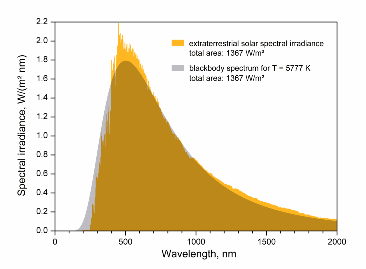
Spectrum of the Sun, matched by a blackbody at about 5800 K


By looking at the spectrum of the Sun above, we see that it glows as an approximate blackbody with an effective ("surface") temperature of about 5800 K.  The amount of energy generated per second (the luminosity) then depends (sensitively!) on this temperature as well as how big the emitter (Sun) is:
\[L_{\odot}=\sigma A T^4=4\pi R_s^2 \sigma T_s^4 \approx 4\times 10^{26}\;\text{Watts}\]
Then we imagine that this total energy, emitted uniformly in all directions, is spread out around the inside of a gigantic sphere extending all the way out to the Earth's distance from the Sun.  Since the imaginary sphere completely wraps around the Sun, we know that it absorbs all the Sun's energy; in particular, each square meter of the surface absorbs only a tiny fraction of the total luminosity --- we just divide by the total surface area of the sphere to get the solar flux \(F_{\odot}\) of luminosity through each square meter:
\[F_{\odot}=\frac{L_{\odot}}{4\pi D_s^2} \approx 1400\;\text{Watts/m}^2\]
where \(D_s\) is the radius of this big sphere, which is the distance from the Earth to the Sun (\(1.5\times 10^{11}\) meters).  So, in principle, each square meter directly facing the Sun receives this much energy per second.  The problem is that not every square meter on the surface of the Earth points at the Sun --- close to the equator this is a pretty good approximation, but at the poles the sunlight is much more indirect.  One easy way out of a complex calculation is to imagine some sort of projection screen behind the Earth, where it's easy to realize that the total amount of sunlight blocked is just the same as the area of Earth's shadow, which is a circle.  So then the Earth intercepts an amount of sunlight equal to
\[(F_{\odot})(\pi R_e^2)\]
where \(R_e\) is the radius of the Earth.  Actually, this is still not quite right.  Not all the solar energy falling on the Earth is absorbed; some of it is reflected back into space by the surface, atmosphere, and clouds.  The percentage reflected back is called the albedo, and for the Earth an average value is about \(a=0.30\).  So that means that only about \((1-a)F_{\odot}\) reaches the surface and warms the planet.  The expression, then, for the solar radiation \(S\) warming the Earth is
\[S=(1-a)F_{\odot}\pi R_e^2\]
Finally, let's invoke the physics of energy balance --- if the Earth receives that much energy, and it's in equilibrium, it must radiate that much energy as well, and it radiates over it's entire spherical surface area.  So now we just make the Earth a radiator just as we did for the Sun to begin with:
\[(1-a)(F_{\odot})(\pi R_e^2) = \sigma (4\pi R_e^2) T_e^4\]
Now we can solve for the effective (radiative) temperature of the Earth!  Simplifying,
\[T_e = \left[\frac{(1-a)F_{\odot}}{4\sigma}\right]^{\frac{1}{4}} \approx 256\;\text{K}\]
after plugging in the numbers.  The effective temperature is sensitive to high albedo, as you can see in the plot below.  A perfectly absorbing (black) Earth would have a temperature of 280 K; however, a highly reflective Earth (perhaps covered in snow/ice) would be far cooler.  That most likely had significant effects in Earth's past.

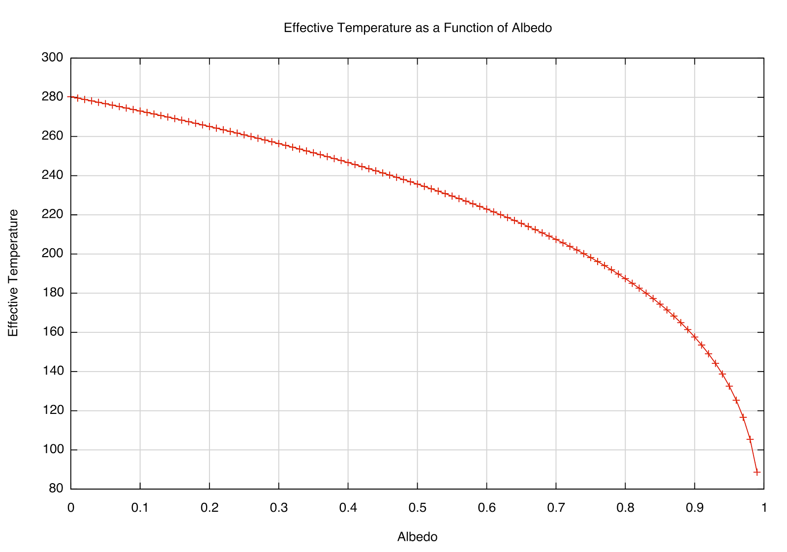
How the \(T_e\) depends on reflectivity (albedo) of a planet at the Earth's distance from the Sun.


Since 273 Kelvins is the point where water freezes, an average temperature of 250 K is a little strange --- it's hard to imagine much liquid water on the surface if the average temperature around the globe is below \(0^{\circ}\)F!  What we've really done is calculate the temperature of a bare rock without accounting for any action of an atmosphere.

One simple way to model an absorbing atmosphere is to imagine a single layer that is transparent to the Sun's visible radiation, but absorbs infrared radiation (heat) emitted from the ground.  A schematic is below:

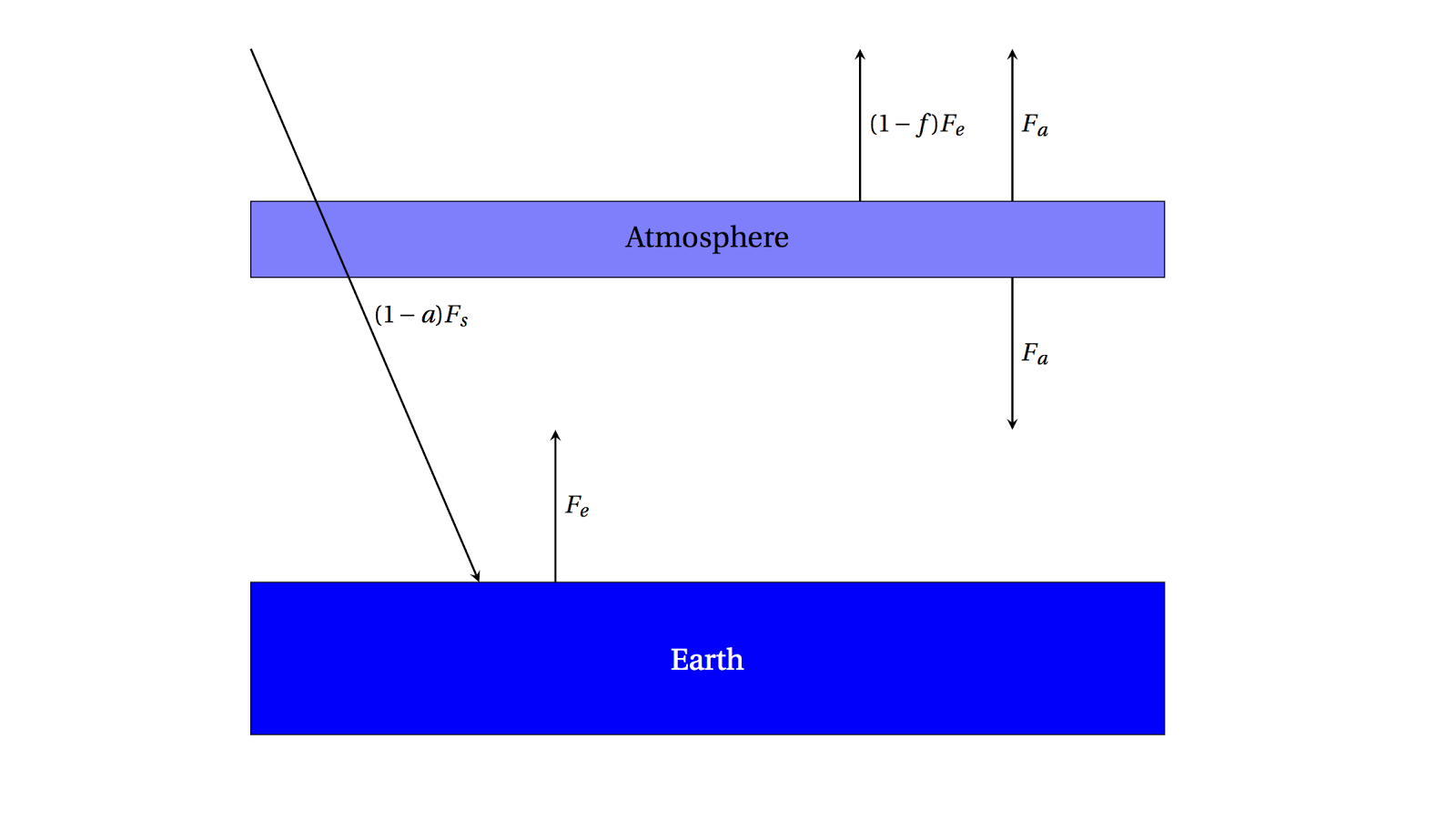
A single-layer absorbing atmosphere model.


Radiation from the Sun \((1-a)F_s\) passes through the atmosphere and warms the ground, which emits \(F_e\) as we've found.  This radiation, though, is partially absorbed on the way out to space by the atmosphere by the fraction \(f\).  \((1-f)F_e\) can then escape to space, but the radiation emitted by the atmosphere is \(F_a\) in both directions.

Now we can write a new set of energy balance equations:  for the radiation escaping to space,
\[F_s = (1-f)F_e + F_a\]
which, in words, means that the radiation coming in from the Sun has to equal the amount emitted by the Earth, which is composed of both the amount absorbed and then emitted by the atmosphere as well as the amount emitted by the Earth that is not absorbed by the atmosphere.  Also, we can write
\[fF_e = 2F_a\]
for the atmosphere itself --- the amount of radiation from the Earth that is absorbed must be equal to the total amount emitted (in both directions, so we multiply by 2).  Then we can solve for \(F_e\)
\[F_s = (1-f)F_e + \frac{f}{2}F_e = (1-\frac{f}{2})F_e\]
\[\Rightarrow F_e = \frac{F_s}{1-\frac{f}{2}}\]
and since, from before, \(F_e = \sigma T_e^4\), and plugging in what we had for \(F_s\),
\[T_e = \left[\frac{(1-a)F_s}{\left(1-\frac{f}{2}\right)4\sigma} \right]^{\frac{1}{4}}\]
This dependence of \(T_e\) on the absorption fraction \(f\) is plotted below:

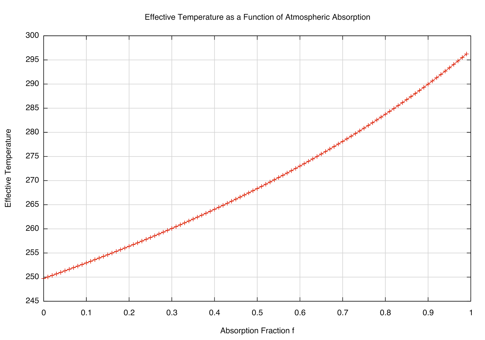
How the \(T_e\) varies as the absorption fraction of the atmosphere.
This makes sense --- if \(f=0\), we're back to the "bare rock" we had before (no atmosphere), but interestingly, if \(f=1\) (totally absorbing), we get \(F_e = 2F_s\), and a temperature of about 297 K.  The observed global mean temp is about 288 K, meaning that the atmosphere absorbs about 85% of the infrared radiation emitted by the Earth (according to our very simple model and rounding off some numbers).  We can also solve for \(T_a\), which would be the emission temperature at the top of the atmosphere --- that works out to be about 240 K for the simple model (roughly what we actually see at the top of the troposphere) and about 210 K for more detailed models taking into account the changing density of the atmosphere at different elevations.  This is interesting --- since the amount of radiation from the Sun doesn't change much, then if the lower atmosphere is heating, the upper atmosphere should be cooling to compensate.

One of the utilities of toy models like this is to get a feel for how the physics works.  For example, one objection I've heard to the idea that increasing concentrations of greenhouse gases will continue to warm the planet is that, since they absorb already a large fraction of outgoing radiation, adding to it doesn't further increase the temperature.  This may at first sound reasonable, but it ignores the physical model of what's really happening --- it's not just that the gases trap the heat, but they re-radiate it.  Let's suppose, just to make the point, that \(f=1\) in our atmosphere, so that it is perfectly absorbing.  What happens when we insert another layer of such an atmosphere?  This would look something like this plot:

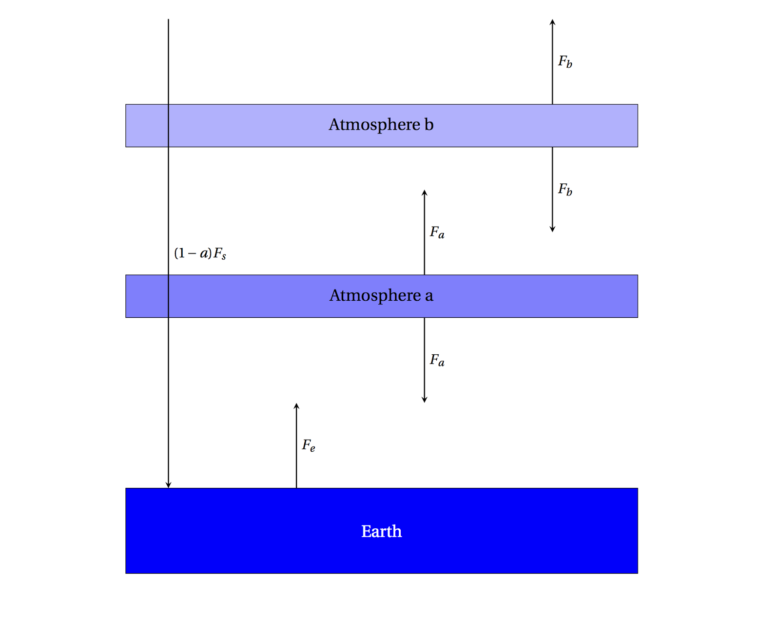
A 2-layer simple atmosphere, perfectly absorbing the outgoing radiation.
Now setting up the energy balance equations looks like
\[F_e + F_b = 2F_a\;\text{for Atmosphere a}\]
\[F_a = 2F_b\;\text{for Atmosphere b}\]
\[F_s = F_b\;\text{incoming/outgoing}\]
then
\[F_e + F_b = 4F_b\]
\[F_e = 3F_b = 3F_s\]
This is the same as what we had before in the \(f=1\) case, only there is a factor of 3 instead of 2 before, so you can compute that \(T_e=329\) K.  Note that the Earth's radiation was already absorbed, but adding more greenhouse gas has the effect of further absorbing the radiation emitted by the first layer.

Sunday, March 23, 2014

TAU Chapter 2 --- Motion in the Sky

A very useful procedure in science is to construct a "toy" model in an attempt to explain some phenomenon and then modify it as needed once longer and/or more detailed observations are made. Let's do this in trying to explain the motion of objects in the sky -- in this way we'll also be (in a very simple sense) retracing the efforts of people over thousands of years to develop a cosmology, a robust and consistent explanation of how the Universe as a whole works.


Sun's apparent path on an "ideal" day.  Note that the angle
that the Sun's arc makes with the vertical is the
same as the angle of Polaris above the horizon.
For example, maybe the simplest observation you can make is that the Sun rises in the East and sets in the West.  Now, for simplicity, we'll assume that you're making your observation at a special time and place where sunrise is at exactly 6 am and sunset is at exactly 6 pm.  Of course, most days aren't like this (for reasons we'll discuss later), but usually in "toy" models we make many simplifying assumptions and then slowly generalize to the "real" case after we think we understand things.  Now let's suppose you're in the Northern Hemisphere in the middle of the United States, perhaps in Oklahoma City.  If you keep careful track of the Sun's position in the sky during the day, you'd see something very much like the diagram at left.  Notice, for example, that the Sun doesn't climb directly overhead (this overhead direction is called the zenith) but traces an arc across the sky that is always somewhat south of the zenith.  In fact, if you were very careful in your measurements, and if you were able to turn off the pesky blue glow of the atmosphere in order to be able to see stars during the day (yes, they're there all the time!) you'd see that the southerly angle of the sun at noon is the same as the "elevation" of a certain star above the horizon.


You would also notice that the stars move much as the Sun does, but their motion reveals an interesting pattern --- only some of them seem to rise and set.  There are others towards the North (for example, the Big Dipper in the Northern Hemisphere) that trace little circles around a certain stationary star mentioned earlier (actually, that star is a supergiant 50 times larger than our own sun (!) called Polaris, the "North Star", and makes a tiny little circle of its own).  After watching this motion for a while, you might convince yourself that the Sun, Moon, and stars in the heavens seem to be glued to a great dome that rotates around us, where the axis of the dome points very nearly at Polaris.  As this pattern seems to repeat itself daily, let's propose this to be a first cosmological model.  

The Sun's apparent path in the winter (lower arc) and the
summer (higher arc).
As with any scientific model, we should try to imagine consequences of the model, or predictions that it makes that we could check.  For example, if all the heavenly objects really are just firmly affixed to the rotating sphere, the Sun ought to rise and set at the same point every day.  Maybe this appears to be true to your naked eye for a few days, but if you carefully record the position of the rising and setting sun you'd notice that it changes slowly as the year goes by.  The Sun in the wintertime (for those of us in the Northern Hemisphere) rises noticeably further to the south than it does in summertime.  The stars do not follow the same pattern so it cannot be true that the Sun is "stuck" to the cosmic dome in the same way that the stars are.  We'll look at the consequences of the changing apparent position of the Sun in the next chapter.  It is also readily apparent that the Moon changes position (and phase!) from one night to another.


There are other lights in the sky that follow very strange patterns of movement relative to the stars if we carefully observe them over a long period of time:  these we'll call planets, from an ancient word meaning "wanderer".  As an example, look at the path of Mars above.  If you were to look at the same patch of sky and take a picture of the position of Mars every night from May 1 to Nov. 1 in 2018, you'd see Mars trace out a surprising loop as the weeks go by.  As the video shows, Mars initially appears to move across the sky relative to the stars steadily, and then start moving backwards for a time, then continue roughly in the original direction again.  This apparent backwards motion (which happens for each planet) is called retrograde motion.


Well, obviously our simple initial model needs to be revised (this is exactly the process of science!).  Sometimes we are lucky and a beautiful spark of imagination occurs to someone whereby a truly new and simpler model is able to explain the new as well as the old data.  The usual way of modifying an existing model, though, is to add just enough new complexity to explain the new observations while still remaining consistent with all prior observations.  For example, if our first simple model had all the heavenly lights stuck to a single rotating cosmic dome, an easy modification would be to suppose that each object that moved in a "weird" way might move on its own independent Celestial Sphere (and all of these spheres obviously still rotate around the Earth).  But how to explain the retrograde motion?  The prejudice of the time was to assume all heavenly motion was perfect, which meant to them that all motions must be circular and uniform (not changing in speed).  It's difficult to account for the backwards motion of the planets if their speeds are constant!  The solution, ultimately formulated in an approximately final model by Ptolemy in about 150 AD, was very clever indeed.  What if Mars, for instance, traveled on a sphere (an epicycle) that rides along on another sphere (called the deferent)!  This combined motion can be made to reproduce the observed loop as shown above without violating the above assumptions --- all motion is circular and uniform, as long as the added complexity of more spheres is still palatable.  Note in the little movie that the arrow representing our sight line to Mars will temporarily move backwards from time to time just like the "real" motion as seen from Earth.


The classical geocentric Ptolemaic model
The eventual model had, in outgoing order, the Moon, Mercury, Venus, Sun, Mars, Jupiter, Saturn, and the "fixed" stars, each on their own sphere rotating around the Earth.  Additionally, as we've seen, it's necessary to put all but the Moon, Sun, and stars on additional epicycles to account for the observed retrograde motion.

You can see the importance of imagination in science --- it's difficult to create some new model that still can account for all known observations.  Science is rarely a process of deduction, where a conclusion logically follows from some set of premises; instead, it is often inductive, where we try to take a creative leap to a new idea and concoct experiments that may provide evidence for or against it.  This Earth-centered (geocentric) model was a successful explanation of how the Universe worked for about 1,500 years until significant pieces of evidence obtained through careful observation overruled it in favor of a new heliocentric (Sun-centered) model.

By the way, it's commonly thought that only during the Middle Ages was it shown that the Earth was "round" (spherical).  This had actually been demonstrated a number of ways back in ancient Greek times by Aristotle, among others, but the most precise demonstration and measurement of the size of the Earth was done by Eratosthenes using a fairly simple method (see image).

At the same time on the particular day, a stick in one location casts no shadow,
but a stick in another location does; this is direct evidence of a spherical Earth.
He had read accounts of the observation in a southern town that, on the longest day of the year at noon, sticks happened to cast no shadows and the Sun shone into the bottoms of wells.  That would mean that the Sun was directly overhead.  What set him apart from the myriad of people that knew this fact was that he had the curiosity to ask if that was true in his city of Alexandria.  When the experiment was done, it turned out that at this exact time, sticks do cast shadows.  This immediately convinced him that the Earth must then be spherical, and being an accomplished mathematician, a careful measure of the length of the shadow along with a knowledge of the distance to the southern village allowed him to calculate the size of the Earth to high precision (the shadow made an angle of about 7 degrees with the top of the stick, so the two places must be about 7 degrees apart along the Earth's surface; knowing there are 360 degrees around the sphere meant that they were about 1/50 of a full circumference apart, so knowing that the actual distance between the sticks was about 500 miles and multiplying by 50 yields the right answer of about 25,000 miles around).

Many people knew of this curious observation, but it is truly only the curious people that change the world.

Tuesday, March 18, 2014

Hot Streaks

Chance of having a 6-make streak out of 200 chances as a function of shooting percentage
I was playing around with streak probabilities, and it's remarkable how fast the probability of a certain streak rises with even a moderate increase in percentage per try.  Here, for example, is a toy model of a basketball player who takes 200 3-point shots in a given season.  Suppose we're interested in the chances that, at some point, the player has a "hot streak" of 6 makes in a row --- something that fans are bound to remember for some time.  If the player is a 30% shooter, there is only a 10% chance of such a streak occurring.  But the chances double for a 35% shooter, and for a very good shooter (45%) we'd expect such a streak more often than not.  I suspect these relatively small differences in skill are responsible for attributes of a so-called "streaky" shooter (which are almost never borne out by the statistics).  I chose a 6-shot streak arbitrarily, here is the likelihood for a 4-shot streak over the course of 50 attempts (a few games, so that this might happen a few times during the season, reinforcing the notion of "streaky"):
Chance of having a 4-make streak out of 50 chances as a function of shooting percentage
Here, you can see that for an average shooter (35%) you might expect a "hot streak" 40% of the time over a sample of 50 attempts.

Tuesday, February 18, 2014

Retrograde Motion Animation


A quick render of an animation of the retrograde motion of Mars.  I captured screenshots of the opposition in 2018 (chosen because there was a minimum of other planetary crossings in the field of view) rendered in the excellent (free) program Stellarium and then used the amazing (free) 3D modeling and rendering software Blender to composite the separate frames into an animation.  It's captured in standard HD (1280x720) so it should be viewable on the YouTube site with much better resolution than the above.  

Really, just testing the method here --- now I know how I can use these packages for many other illustrations and movies I'd like to do.

Friday, February 7, 2014

Real Fakery

Schematic of motion across the sky

I'm finding, often, that trying to attain some imitation of realism in an illustration involves more and more clever fakery.  I was working on the above image for a chapter describing how we see objects move in the sky.  To make the stars stand out I figured I needed a nearly black background, but one subtle principle in mimicking outdoor scenes is that shadows ought to never be black.  The sky actually is an emitter of blue light.  Ok, usually then I'll turn on an "environment" background glow to give a nice subtle tint of blue to fill in the shadows, but then I'll lose the black background.  A simple solution is to make a blue-light-emitting plane and position it just out of view above the scene.  So far, so good.  The problem is that the sunlight does not actually emit from the "sun" in the image, as the real Sun's rays arrive from a very distant source and are about parallel when they illuminate things on Earth.  For example, if I put a tree just to the north side of the East axis, I don't want its shadow pointing in a different direction from a tree on the south side of the axis.  That would be weird.  So when I make the rays come from a true Sun-like distant source, the new problem is that the previously-cleverly-placed plane now casts a distinctly unrealistic shadow on the scene.

What I really need is a light emitting plane that does not cast shadows (!), and lo!  I discover there's a little checkbox on the plane's properties that turns off its shadow-casting properties.  Neat.  This image is the result.  Actually, I'll probably never have a static image that looks like that --- too busy.  The little stars are only visually meaningful in an animation, when it's clear they're following the "Celestial Sphere" around an axis going approximately through the North Star.  The nice thing is that once this is set up, I can use the same basic setup to illustrate the seasonal variation of the Sun in the sky as well as one view of Moon phases.

Monday, January 27, 2014

TAU Chapter 1 --- Scales of Space and Time

Increasing size scales, roughly a factor of a billion each step
One of the most important ideas to begin to understand is the immense differences in scales and size that we'll be investigating.  It's hard to get around the prejudice that limits our imaginations to things we've encountered on the Earth --- to most of us, "small" means something like a sand grain, perhaps a fraction of a millimeter (the smallest marks on a metric ruler or meterstick).  "Huge" might bring to mind a mountain or vast expanse of forest, maybe thousands of meters or many miles across (or tall).  This somewhat provincial attitude will be strongly challenged by the objects and distances we encounter even in our own Solar System, not to mention the unimaginable vastness of the Universe as a whole.  The entire Earth, as we'll see, is a tiny speck floating in a huge expanse; but even the smallest sand grain on the Earth is unfathomably gigantic when viewed from the perspective of its constituent atoms.  The astonishing promise is that all these fantastically different scales are all described by the same physical laws, which gives us some hope of understanding the Universe around us.

The above images represent a series of increasing size scales typical of objects we'll be studying.  Atoms begin our scale on the small end.  There are 92 different atoms, or building blocks, out of which all the “ordinary” matter in the Universe is made.  Each type, or element, has atoms of different sizes; a rough average size for an atom is about a ten-billionth of a meter.  Lining up a billion atoms will just about span the width of a couple of apples.  But wait, I’ve just invoked an enormous number that is quite beyond most of our imaginations already, so have I really told you anything at all?  Just how big is a billion?  It is a number of increasingly common usage, describing the economic costs of massive projects as well as the populations of the largest countries.  It is written as a 1 followed by 9 zeroes: 1,000,000,000.  As a shorthand, we write it also as  \( 10^9 \), indicating that it is 10 multiplied by itself 9 times.  If you don’t have some way of imagining a billion things, though, it’s difficult to make any sense out of the relative scales of thousands, millions, and billions.  These days, such a sense is needed to evaluate national-level programs.  Is a $10 billion project a lot more expensive than a $500 million one?  (Yes!  20 times the cost.)  If we can save $70 million from a proposal costing $7 billion, what percentage savings is that, really?  (Only about 1%!)  And so on.  

A thousand little boxes
First, let’s try to visualize a thousand things (1,000, or \(10^3\)):  The bottom of this cube is a square made of 10 rows of 10 boxes in each row, so there are 100 boxes on the bottom layer.  To make the cube, we stack 10 of these layers on top of each other, so you should convince yourself that there are a thousand boxes in the cube.

A million little boxes

Now let's step up to a million things (1,000,000, or \(10^6\)).  You should see, especially if you look at the full-resolution image, that each little box has itself been subdivided into a thousand still smaller little boxes.  There are now a thousand groups of a thousand things, which is a million.

Ok, now on to a billion!  Continuing the pattern, if you can somehow imagine each of the tiny boxes above subdivided into a thousand still tinier boxes, then there will be a billion little boxes in the big cube.  So a billion is a thousand groups of a million.  One fairly easy way to try to visualize a billion is to consider an ordinary meterstick.  The smallest marks are millimeters, so there are a thousand of them along the stick.  If you imagine a large box that is 1 meter square on the bottom by 1 meter high (a cubic meter), then there will be 1 billion millimeter-sized boxes contained inside.  Since a sand grain is perhaps a millimeter across, then a box of sand 3 feet high, 3 feet wide, and 3 feet deep would contain something like a billion grains.  If you were to lay out all the millimeter boxes next to each other in a line, it would stretch a distance of 1000 kilometers, or about 600 miles (from Oklahoma City to Denver, roughly) --- if atoms were just barely visible, like grains of sand, then everyday objects like apples would be the size of a few states across.  Of course, this works for counting anything, so it’s also interesting to try to imagine a million seconds, which is about 11 and a half days.  A billion seconds, though, is almost 32 years; you are likely to live somewhere between 2 and 3 billion seconds.  The Universe has been around about a billion human lifetimes, or about a million times longer than modern humans have existed.  It'll be useful to remember that these expansive scales exist not only for space, but for time.  We tend to think that a second is a short snippet of time, but there are processes that happen on fantastically short timescales.  Ordinary yellow light, for example, is ultimately the result of something vibrating 600 trillion (a thousand billion) times each second!  There are very important reactions we'll discuss later that occur only for a duration of \(10^{-18}\) seconds (a billionth of a billionth of a second).  In perspective, there have only been about \(10^{18}\) seconds since the Big Bang (half that, if you're being picky), so as many of these events could occur each second as there have been seconds since the beginning of the Universe!


The relative size of the Sun and the Earth --- the Sun is more than 100 times larger across, and over a million Earths would fill up the Sun's volume.
Now let’s look at the sizes of objects again in the first image.  The first step from an atom to the everyday scales represented by an apple is an increase in scale by a factor of a billion.  If we take the next step and line up a billion apples, then we're approaching the size of the Sun (see the above image!).  Really, the Sun is about 15 billion apples across --- truly gigantic compared to any objects humans have been accustomed to dealing with throughout our history.  It is remarkable that just in the last 100 years or so we have pretty well figured out the physics of atomic interactions a billion times smaller than we as well as the inner workings of the Sun and other stars ten billion times larger.  It’s a wonderful thing that the Universe seems to obey understandable laws on these wildly different scales.  We routinely study objects on even larger scales, though.  200 billion stars more or less like the Sun are gathered in our Milky Way galaxy, a truly immense structure that is about six billion times larger than the distance from the Earth to the Sun!  Just as roughly the size of an atom is to an apple, and that apple is to the Sun, our solar system is to our enveloping galaxy.  It is fascinating that we can view the gigantic Milky Way every clear night from Earth; our perspective in trying to fully comprehend this object is in some way similar to an atom's perspective of aggregate objects such as we.

A slice through our Universe showing the distribution
of galaxy clusters
But the Milky Way galaxy is not the largest structure in the Universe, although 100 years ago we were not aware of anything larger.  There are estimated to be around 150 billion galaxies in the observable Universe, which apparently spans the equivalent distance of about a million Milky Ways across and is arrayed in beautiful networks of galaxy clusters and superclusters, as shown here (each dot represents a galaxy cluster, with ours at the center of this map).  Only now, for the first time in human history, we are able to map the large-scale structure of the Universe.  Many previous cultures wondered and guessed at the nature of the Universe as a whole and what it might look like.  We are the first privileged generation to finally address and answer these fundamental questions addressing our cosmic context and place in the Universe.